In a fit of randomness, I decided today that I need to review a silly, clever book I just read, called
Y is for Yorick: A Slightly Irreverent Shakespearean ABC Book for Grown-Ups. It's written by Jennifer Adams, the author behind the BabyLit board books, which are charming, uber-basic illustrated editions of classics such as
Pride and Prejudice (a counting primer),
Anna Karenina (a fashion primer), and
Don Quixote (a Spanish language primer), among others. But while those books are actually suitable for babies and toddlers,
Y is for Yorick really is, as the subtitle declares, for grown-ups. It's not "adult" per se, but the humor is the kind that grown-ups who like Shakespeare will appreciate.
For instance, we learn that "P is for Polonius," who was a "long-winded blowhard who was always giving unwanted advice. Eventually Hamlet killed him." Then, because many of the letters get bonus entries, we learn that "P is also for Prospero," who "was a bit of a control freak who liked the special effects. But who knows what any of us would do with unlimited time on a deserted island and a book of magical spells?" As often happens with alphabet books, whether for children or adults, the author has to reach a little for X and Z, but I think she does a pretty good job (and no, I'm not going to give spoilers on those!)
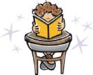
Aside from the text, the illustrations in this book, by Hugh D'Andrade, are both humorous and charming. They're all done in the same silhouette style shown on the cover: black (with the occasional spot of white) against a colored background, with faint pencil marks still showing. One of my favorites is the one above, showing Benedick pulling Beatrice's hair. I do find it a little odd that the illustrator's name doesn't appear on the book's cover, nor is there an "about the artist" blurb to go along with the author's bio on the back dustjacket flap. The illustrations, as well as the book's overall design (by Ron Stucki) really make this little volume, and I think the artist should be given more obvious credit (although I was pleased to see the author thank him in her acknowledgments).
And reading this fun bit of fluff reminded me of another book I stumbled across a few years ago, likely on a bargain table somewhere: The Not-So-Very-Nice Goings On at Victoria Lodge by Philip Ardagh, which carefully notes that the book is "without illustrations by the author." That's because the entire conceit of the book is that the author has written a silly little story around illustrations from issues of The Girls' Own Paper that appeared in the 1890s.
So how does that work? Well, you know those decorated/illustrated drop cap letters that used to start off chapters or sections in publications of old? Early in the story we see a picture of a lovely begowned lady standing by the letter "M"; the "narrator," Thelma, helpfully explains that her "tragic tale began when my eldest sister Edith was tending to the letter M in the shrubbery. We had a number of letters in our garden and it was her duty to feed and water the consonants from J to T."
How funny is that? And the plot (and shrubbery!) thickens when sinister attempts are made on Thelma's family's lives, such as when her younger sister is playing the piano when her music teacher "was shot through the window by a markswoman in a hot-air balloon," a moment that's illustrated with a drawing of a woman dramatically holding her hand to her forehead while leaning to look out a window. It's hard to convey how well this little set-up works just by describing examples, but it really does work, and I laughed out loud a couple of times.
I love clever stuff like this. Words are fun!


No comments:
Post a Comment